Lost & Found: React Redesign
A responsive, installable community board for reporting lost and found items, rebuilt from the original graduation project as an accessible React product demo with search, filters, privacy controls, and complete account and report-management flows.
- Role
- Solo: product redesign, design system & frontend rebuild
- Timeline
- Original: Nov 2023 to May 2024 · Rebuild: Aug 2026
- Platforms
- Responsive web · Installable PWA
- Deployed on
- Vercel
- React 19
- React Router 7
- Vite 8
- Tailwind CSS 4
- Zustand 5
- Vite PWA
- Local mock APIs
- Vercel
- Figma
- VS Code
- Browser DevTools
- Routed views & states
- 17
- Item categories
- 6
- Demo reports
- 12
- Installable experience
- PWA
Overview
The project
Lost & Found began as my final-year BSc Computer Science project at the University of Baghdad. The original 2024 version was a full-stack Node and MySQL application and received an A+. In August 2026, I returned to the same problem and rebuilt the experience around the standards I use now: clearer information architecture, an explicit design system, accessible interaction states, responsive layouts, and reusable React components.
The current live release is intentionally a frontend-only product demo. It ships with twelve realistic reports, six categories, a visible demo account, protected account routes, search and filtering, privacy controls, report creation and editing, reunited and delete actions, and installable PWA behavior. Mock API modules preserve asynchronous loading and mutation flows, while Zustand keeps authentication, navigation, and modal state in memory; demo changes reset when the page refreshes.
This rebuild is not presented as the old backend wearing a new skin. It is a complete product and frontend redesign that preserves the graduation project's core idea while being honest about its current scope. One deployment limitation remains: nested routes work through in-app navigation, but direct deep links currently need a Vercel SPA rewrite before they can load independently.
How it was made
Design process
Re-audit
Reviewed the original graduation project screen by screen, keeping the useful domain model while removing the visual and technical debt.
Reframe
Defined the current product as an honest, frontend-only demo with complete lost, found, reunited, search, account, and report-management states.
System
Created semantic color, type, spacing, radius, shadow, motion, and z-index tokens before rebuilding individual components.
Prototype
Reworked the information architecture around search, category browsing, clearer report cards, privacy controls, and responsive navigation.
Rebuild
Implemented the redesign in React with reusable UI primitives, feature modules, guarded routes, local mock APIs, and PWA support.
Verify
Checked every public and signed-in route at desktop and mobile widths, then refreshed the portfolio gallery from the deployed product.
What I learned
Research insights
Search is the fastest path
People rarely know where an item was filed, so the home page now puts keyword search and optional category/status filters ahead of the catalogue.
Status must read without color
Lost, Found, and Reunited use distinct semantic colors, but every state also carries an explicit text label so meaning never depends on color alone.
Privacy belongs in the account flow
Email and phone visibility are first-class profile controls, and reunited reports hide contact details once a recovery is complete.
A demo should be transparent
The current release uses a visible demo account, local mock data, and in-memory actions that reset on refresh instead of pretending to be a production service.
Recovery needs more than happy paths
Loading, empty, error, verification, not-found, confirmation, and image-fallback states make the experience understandable when data or actions are incomplete.
Why it looks like this
Key design decisions
Search-led information architecture
Keyword search, optional filters, and six scannable categories create multiple paths to the same report
Explicit lifecycle states
Lost, Found, and Reunited labels clarify intent, ownership actions, and when contact details disappear
Semantic token system
Components consume role-based color, type, spacing, radius, shadow, motion, and layer tokens
Accessible by default
Visible focus, reduced-motion support, minimum touch targets, clear labels, and resilient feedback states
Progressive report detail
Compact cards support scanning; the detail view adds the full description, owner information, and management actions
Calm community voice
DM Sans, Inter, and a restrained blue system keep the product helpful, legible, and trustworthy
The screens
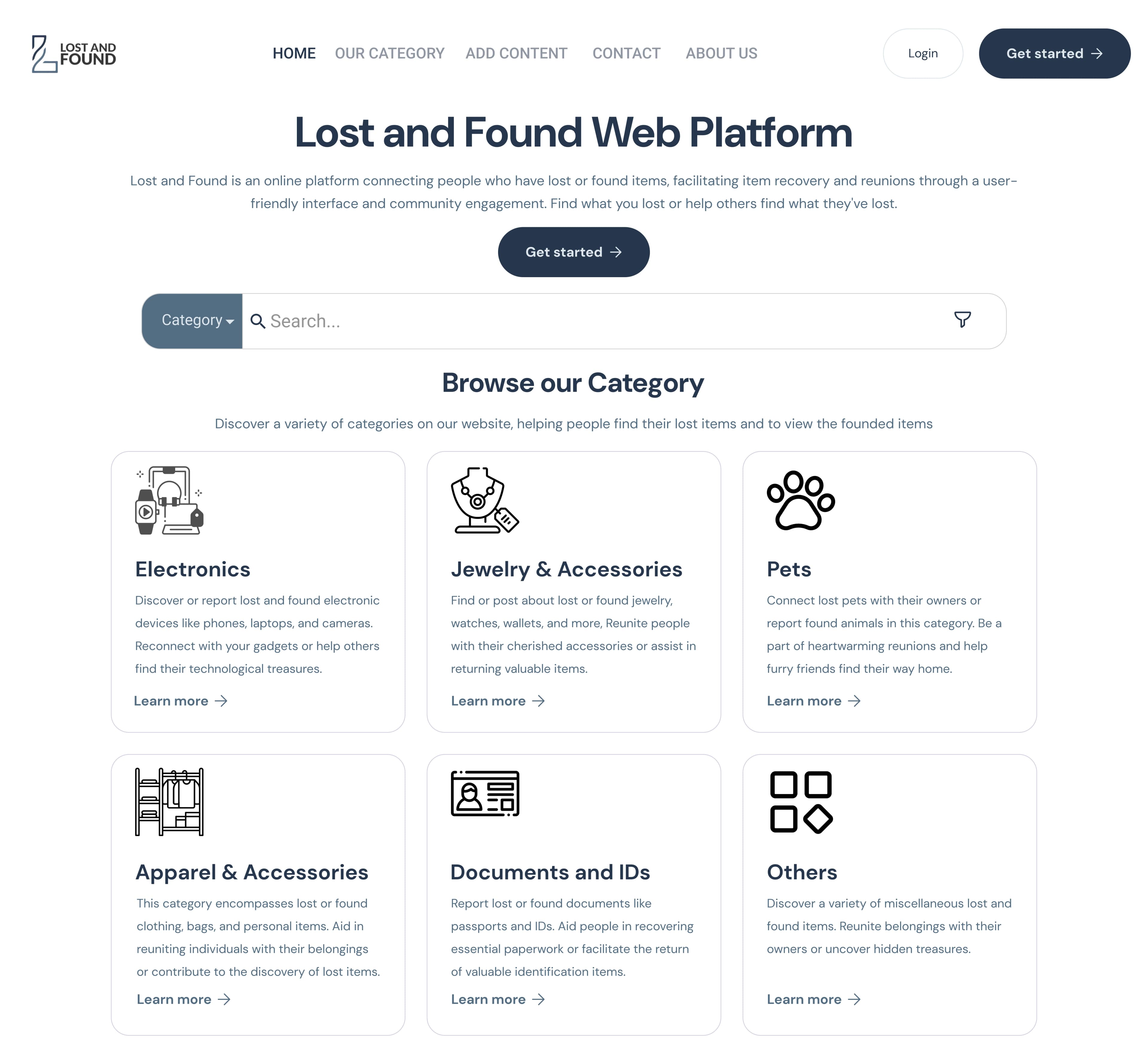
Gallery
What I used
Tools
Figma
Original product design and redesign direction
Design tokens
Semantic visual system and responsive rules
Playwright
Route, state, viewport, and screenshot verification
What's inside
Features & pages
Search & filter
Search report titles and descriptions, then narrow results by category and Lost, Found, or Reunited status
Report lifecycle
Create, view, edit, mark reunited, and delete reports with clear confirmation and feedback states
Demo accounts & privacy
Sign up, log in, edit a profile, change a password, and independently control email and phone visibility
Image-first reporting
Local item photos, upload previews, resilient fallbacks, and consistent card/detail crops make reports recognizable
Responsive installable app
Mobile navigation, 44px touch targets, reduced-motion support, and a Vite PWA manifest extend the experience beyond desktop
Complete route states
Protected routes, loading and empty states, email verification, error boundaries, confirmations, and a custom 404
What was hard
Challenges & solutions
Problem
The portfolio still described the original Node, Express, EJS, Bootstrap, MySQL, Railway, and upload/email backend even though the current repository had been redesigned as a different product architecture.
Solution
Reframed the current release accurately as a React frontend demo, removed the obsolete backend claims, and kept API modules around the mock layer so a real service can replace it later without rewriting the page components.
Problem
A growing collection of one-off colors and component styles would have made the redesign inconsistent and difficult to audit.
Solution
Built one semantic token layer for color roles, typography, spacing, radii, shadows, motion, glass surfaces, and z-index; components use those roles instead of arbitrary Tailwind defaults.
Problem
The original desktop layouts did not cover keyboard focus, comfortable touch targets, reduced motion, or compact mobile navigation.
Solution
Added visible focus treatment, 44px interactive targets, reduced-motion behavior, responsive grids and menus, text-backed status badges, and mobile-first form layouts.
Problem
A frontend-only demo still needed realistic flows without implying that data or authentication persisted like a production backend.
Solution
Used deterministic local reports, a clearly labelled demo account, protected client routes, asynchronous mock APIs, and in-memory mutations that intentionally reset on refresh.
Built with
Tech stack
React 19
Component architecture and interface state
React Router 7
Public, protected, detail, and fallback routes
Vite 8
Development and production build tooling
Tailwind CSS 4
Token-driven responsive styling
Zustand 5
Authentication, navigation, and modal state
Vite PWA
Manifest, service worker, and install prompt
Local mock APIs
Deterministic reports and in-memory demo actions
Vercel
Live frontend deployment
What came out of it
Results
17
Routed views and UX states
21
Fresh desktop and mobile captures
12
Realistic local demo reports
6
Searchable item categories
PWA
Installable responsive build
A+
Original graduation-project grade