Lost & Found Web Platform
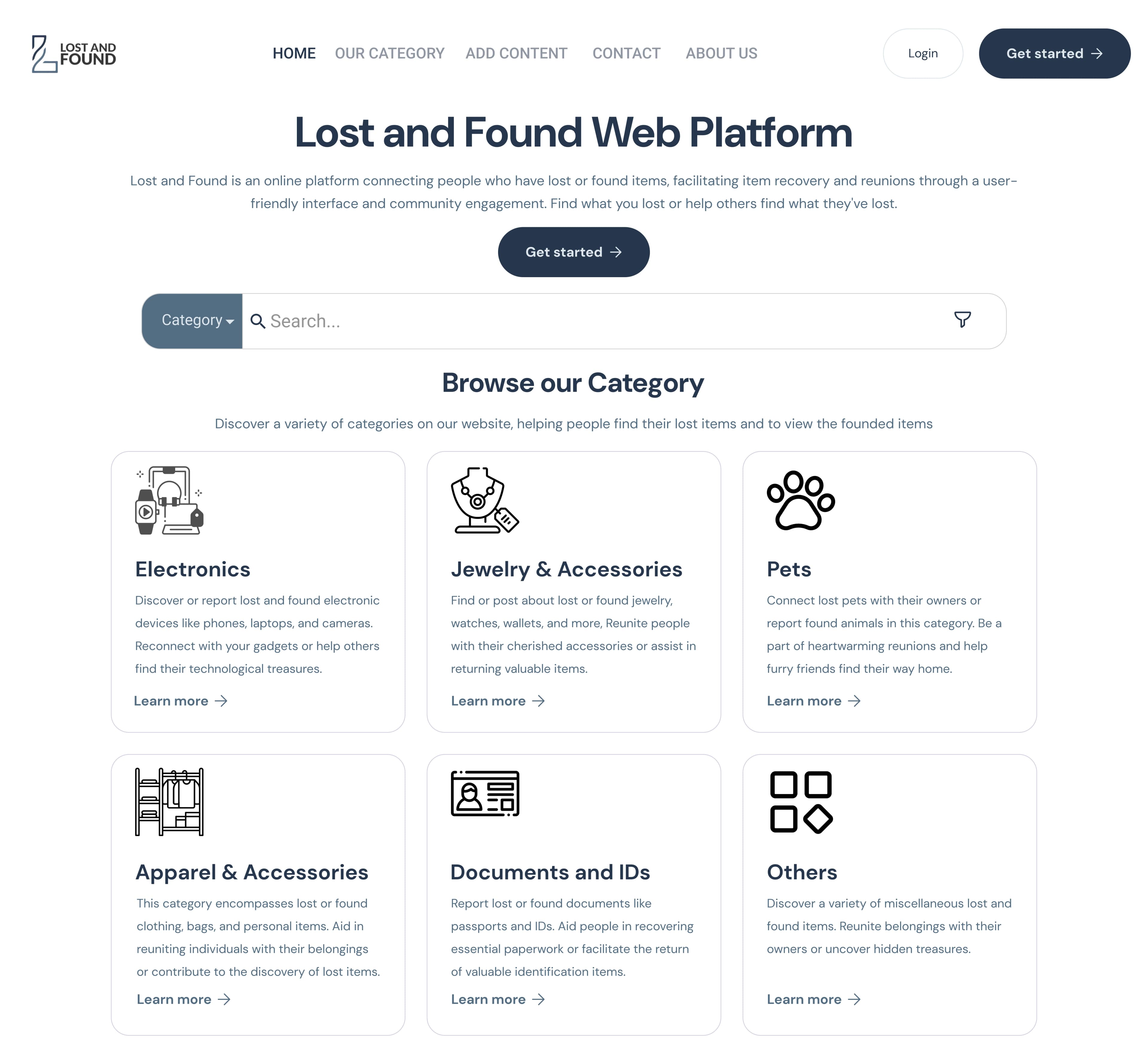
A community platform for reporting and recovering lost items — browse by category, post what you lost or found, and reach owners directly. My final-year graduation project, designed in Figma and built end-to-end as a full-stack web app.
Timeline
Final-year graduation project — 2024
Role
Solo — UI/UX design + full-stack build
platforms
Web — Desktop
tools
Figma
13
Screens designed
6
Item categories
Preview
The brief
Problem & goals
This was my final-year graduation project for a BSc in Computer Science at the University of Baghdad, graded A+. The goal was a single place where people who have lost something and people who have found something can meet — so I designed the full interface in Figma and then built it end-to-end as a working full-stack web app. The design had to make two opposite intentions ("I lost this" / "I found this") live in one simple posting flow, keep a growing catalogue of items easy to browse, and make stranger-to-stranger contact feel safe.
How I worked
Design process
Discover
Studied the lost-and-found problem: what info a post actually needs to reunite an item with its owner
Define
IA & core flows: browse by category, post an item, view & claim via contact, manage a profile
Wireframe
Low-fi layouts for home, category browse, post detail, and the post/auth forms
Visual design
Calm navy palette, clear type scale, and one consistent card system to signal trust
Build
Implemented the full design as a working Node/Express + MySQL platform — not a mockup
Defend
Final screens + the live app presented and graded as the graduation project
What I had to solve
Design challenges
Two intents, one flow
'I lost this' and 'I found this' are opposite actions that share one posting flow; the UI had to make the distinction obvious at a glance — solved with an explicit Lost/Found tag and toggle.
Enough detail to reunite
A post is useless without description, location, and contact; the post form and detail page were structured around exactly what someone needs to claim an item.
Findability at scale
Items spread across many categories, so browse-by-category, search, and per-category views keep a growing catalogue scannable.
Trust between strangers
People share a phone or email with strangers, so privacy toggles (hide phone / hide email) and a calm, credible visual tone were designed to lower that friction.
Design thinking
Key design decisions
Browse-by-category IA
Six clear item categories as the primary way into the catalogue
Lost / Found tagging
Every post explicitly typed so intent reads instantly
Reusable card system
One post-card pattern reused across home, category, and profile
Progressive detail
Short card copy on lists → full description + contact on the post page
Privacy-first contact
Hide phone / email toggles for safer stranger-to-stranger reach-out
Calm, trustworthy tone
Navy palette and clear typography to make sharing feel safe
The work
Screen gallery
Built with
Tools used
Figma
UI design + prototyping
The result
What I delivered
13
Screens designed & built
6
Item categories
A+
Graduation project grade
7
Core user flows
Full-stack
Working platform, not a mockup
More design work
Other projects

Mobile App · UI · UX
Vintagia — Curated Antiques Marketplace
A buy-only mobile marketplace for authenticated antiques. Every piece is curated, provenance-verified and sold at a fixed price — bringing the calm of a gallery visit to a category that usually feels like a crowded auction house. A practice project covering the full journey: research, flows, a tokenized design system and 30 high-fidelity screens in two themes.

Web Design · Bilingual UI · RTL
Alzahraa Hospital — Bilingual Website
A bilingual (English/Arabic, full RTL) hospital website designed to build trust and make departments, stats, and contact easy to find — designed end-to-end in Figma.