Vintagia — Curated Antiques Marketplace
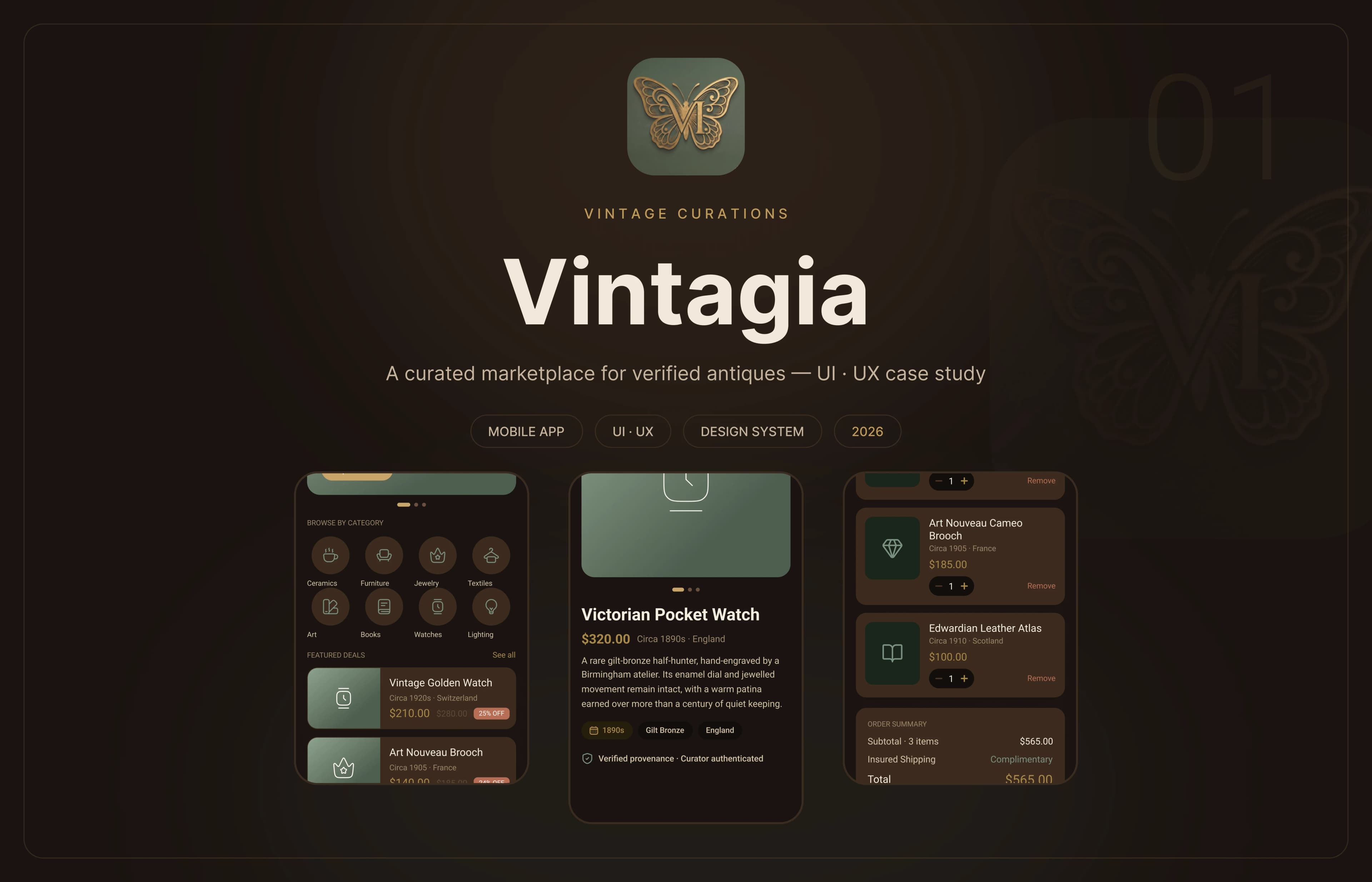
A buy-only mobile marketplace for authenticated antiques. Every piece is curated, provenance-verified and sold at a fixed price — bringing the calm of a gallery visit to a category that usually feels like a crowded auction house. A practice project covering the full journey: research, flows, a tokenized design system and 30 high-fidelity screens in two themes.
Timeline
Practice project — 2 weeks, 2026
Role
Solo — UI · UX Designer
platforms
Mobile — 360px frame
tools
Figma
30
Screens · 2 themes
48
Components
Preview
The brief
Problem & goals
Vintagia is a buy-only mobile marketplace for authenticated antiques — a practice project built to answer one question: how might we make buying a century-old object feel as considered and trustworthy as the object itself? Collectors juggle auction snipers, unverifiable listings and interfaces built for volume rather than connoisseurship, so the design removes the pressure at the model level: fixed prices, no bidding, one gold action per screen, and provenance surfaced directly under the price on every piece. The palette is drawn from the objects themselves — sage patina, gilded brass, aged copper and dark wood — and ships as semantic tokens in twin Light and Dark variable collections, which meant the warm parchment and deep-wood themes stayed in lockstep through every later change. Screens were designed free-hand first; once a pattern repeated three times it was promoted to a component, ending with 48 components governing all 30 screens through 168 instances.
How I worked
Design process
Research
Audit of antique and resale marketplaces; moodboard for a warm, patient, gallery-grade direction
Sketching
Rapid explorations of the core flows — browse, item, cart, checkout — on a dedicated sketching page
Wireframes
Lo-fi structure for all fifteen screens at a strict 360px width, before any color entered the file
Design system
Five brand colors, a Roboto scale and 37 semantic tokens duplicated across Light and Dark variable collections
Hi-fi + components
Fifteen screen pairs, then a componentization pass: every repeated pattern became a reusable component
What I had to solve
Design challenges
Trust is the whole product
Provenance — the single most important fact about an antique — is usually buried in online listings. Verification badges and curator authentication were pulled above the fold, directly under the price, so trust arrives before the ask for commitment.
Auction pressure is the enemy
Countdowns, bidding wars and sniping make a considered purchase feel rushed. Vintagia is buy-only at fixed prices: the anxiety is removed at the model level, not softened with copy.
Collectors save before they buy
The target buyer browses in the evening and returns days later. Favourites are one thumb-tap from every card and get their own tab in the profile, treating the wishlist as a first-class flow.
Dark mode is not an afterthought
An evening browser lives in dark mode. Both themes were built from the same 37 semantic tokens in twin variable collections, so dark is a rebind rather than a redesign — and never drifts from light.
Design thinking
Key design decisions
Trust is the hierarchy
Provenance badge and curator authentication sit directly under the price on every item — verification is never below the fold
One gold CTA per screen
A single Vintage Gold action carries each screen; secondary actions stay outlined. Decisions feel calm, never competitive
Buy-only, no auctions
Fixed prices remove bidding anxiety entirely; checkout runs address to confirmation in three steps, with an order timeline after
Reachable navigation
A four-tab bottom nav with a gold active pill keeps Home, Search, Cart and Profile in thumb reach on a 360px frame
Two themes, one source
Parchment light and deep-wood dark share the same 37 semantic tokens across two variable collections — dark mode is a rebind, not a redesign
Components govern the file
48 components power all 30 screens through 168 instances — a spacing fix is one edit, and no pattern exists twice by hand
The work
Screen gallery
Built with
Tools used
Figma
UI design, prototyping & componentization
Figma Variables
37 semantic tokens across Light & Dark collections
The result
What I delivered
30
Screens · 2 themes
48
Components
168
Instances in use
74
Tokens · 2 collections
26
Icon components
8
Collector categories
More design work
Other projects

Web Design · Bilingual UI · RTL
Alzahraa Hospital — Bilingual Website
A bilingual (English/Arabic, full RTL) hospital website designed to build trust and make departments, stats, and contact easy to find — designed end-to-end in Figma.

Web Design · UI Design · Full-Stack Build
Lost & Found Web Platform
A community platform for reporting and recovering lost items — browse by category, post what you lost or found, and reach owners directly. My final-year graduation project, designed in Figma and built end-to-end as a full-stack web app.